
How can we optimize the onboarding
of a project management tool?
How can we optimize the onboarding of a project management tool?
How can we optimize the onboarding of a project management tool?
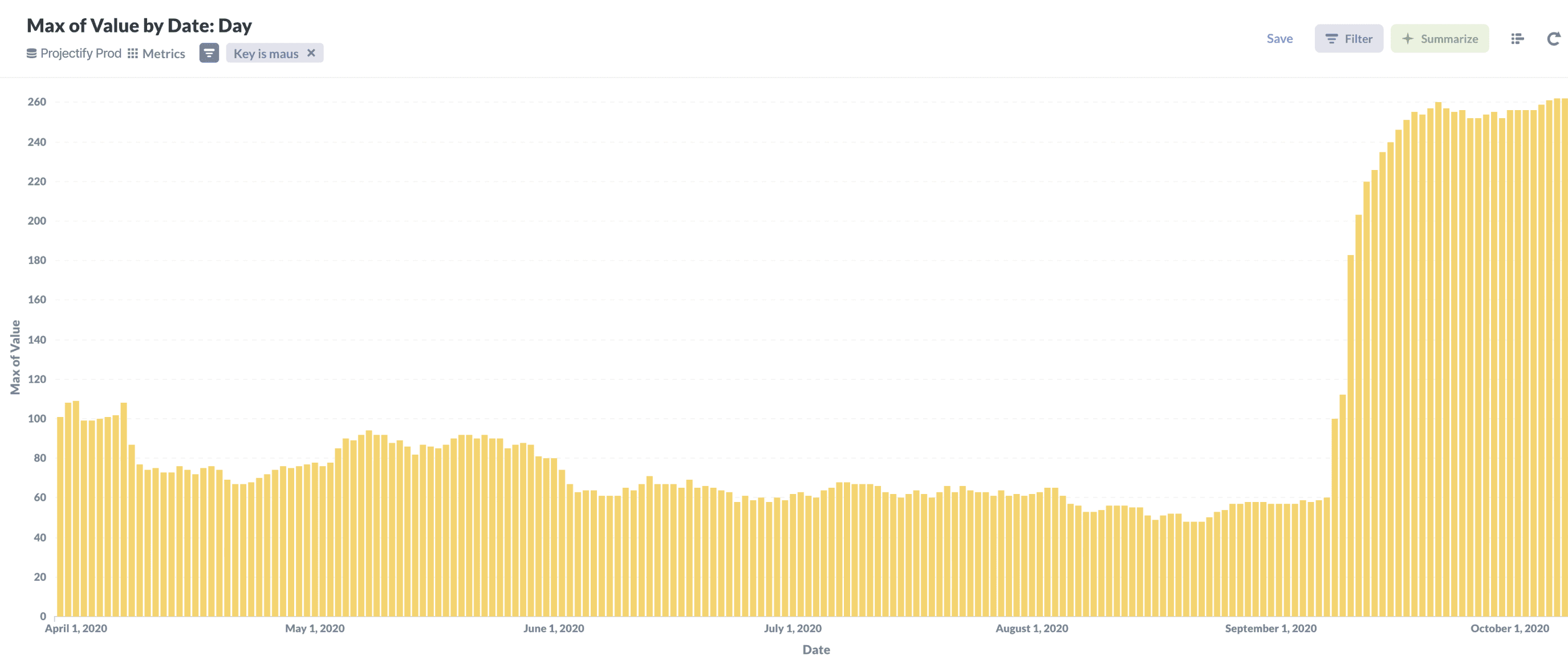
My task was to figure out why after a recent UI update, the monthly active user count decreased by 32%, the bounce rate was at 85%, and sign-up rate stuck at 20%.
My task was to figure out why after a recent UI update, the monthly active user count decreased by 32%, the bounce rate was at 85%, and sign-up rate stuck at 20%.

Overview
Overview
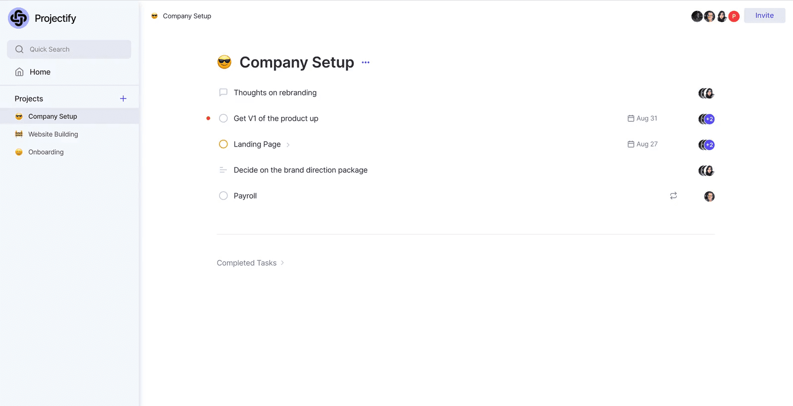
A project management tool that aims to simplify project management.
A project management tool that aims to simplify project management.
In the summer of 2020, I interned at Genesys, working on Projectify, a project management tool. It was a great experience collaborating with designers and engineers, gaining valuable insights into product strategy, developer hand-off, and design systems.
In the summer of 2020, I interned at Genesys, working on Projectify, a project management tool. It was a great experience collaborating with designers and engineers, gaining valuable insights into product strategy, developer hand-off, and design systems.
Industry
Software
Role
UI/UX Designer
Timeline
7 Months
Tools
Figma
Industry
E-Commerce
Timeline
6 Months
Role
UI/UX Designer
Tools
Figma
The Problem
The Problem
The monthly user count dropped by 32% and 85% of visitors bounced.
The monthly user count dropped by 32% and 85% of visitors bounced.
After a UI update, the monthly active user count decreased by 32%, sign-up rate was stuck at 20%, and there was an 85% drop-off after the first interaction. My task was to figure out why and how to fix it.
After a UI update, the monthly active user count decreased by 32%, sign-up rate was stuck at 20%, and there was an 85% drop-off after the first interaction. My task was to figure out why and how to fix it.
Exploring Projectify
Exploring Projectify
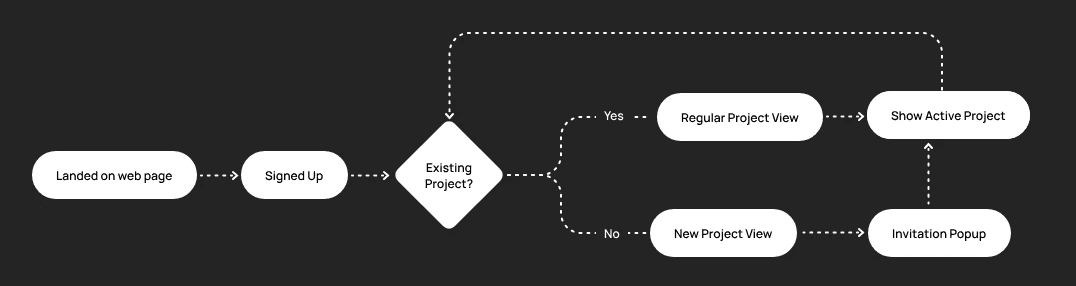
Understanding the existing information architecture.
Understanding the existing information architecture.
I started this project by learning about Projectify. I had meetings with company employees to learn the history and design decisions. Then I explored the website myself to map out the existing user flow.
I started this project by learning about Projectify. I had meetings with company employees to learn the history and design decisions. Then I explored the website myself to map out the existing user flow.

Exploring Metrics
Exploring Metrics
There was a 32% drop in monthly active users in a week after a UI change.
There was a 32% drop in monthly active users in a week after a UI change.
When analyzing the monthly active user count, I learned that there was a 32% drop in monthly active users in a week after a big change in the application's UI and functions.
When analyzing the monthly active user count, I learned that there was a 32% drop in monthly active users in a week after a big change in the application's UI and functions.

Analyzing Quantitative Data
Analyzing Quantitative Data
I checked both Google Analytics and Fullstory sessions for any dropoffs.
I checked both Google Analytics and Fullstory sessions for any dropoffs.
To understand how effective the current onboarding was, I looked at both the Google Analytics and Fullstory sessions to check for any dropoffs and where they occurred.
To understand how effective the current onboarding was, I looked at both the Google Analytics and Fullstory sessions to check for any dropoffs and where they occurred.
85%
of visitors dropped off after the first interaction.
63%
of visitors dropped off after the second page.
50%
bounce rate when users landed on the homepage.
Testing Projectify
Testing Projectify
I evaluated the current user experience by letting them explore first and then asking them to do certain tasks.
I evaluated the current user experience by letting them explore first and then asking them to do certain tasks.
After seeing these metrics, I conducted user research with 5 individuals to understand the issues. I decided to start by watching them explore Projectify first, then nudging them to do certain tasks. Here are some questions I had asked:
After seeing these metrics, I conducted user research with 5 individuals to understand the issues. I decided to start by watching them explore Projectify first, then nudging them to do certain tasks. Here are some questions I had asked:
What does this product do?
What is a template?
What is your daily project routine?
Can you add a task?
Can you add a due date?
Can you assign a task to yourself?
Does the landing page represent your experience?
What is this product used for?
Usability Test Results & Findings
Usability Test Results & Findings
Only 40% of the tasks were being completed successfully.
Only 40% of the tasks were being completed successfully.
The results revealed a major issue: only 40% of the tasks were successfully completed. This meant that Projectify was difficult to understand and navigate without external help.
The results revealed a major issue: only 40% of the tasks were successfully completed. This meant that Projectify was difficult to understand and navigate without external help.

Research Insights
These were the three key insights I discovered.
These were the three key insights I discovered.
Based on the usability test and follow-up interviews, these were the most pressing issues that needed to be addressed.
Based on the usability test and follow-up interviews, these were the most pressing issues that needed to be addressed.
Discovering features.
A few users had a hard time finding features. There were no tutorials or examples on how to get started. There were also usability issues which led to users not knowing that certain features existed.
Discovering features.
A few users had a hard time finding features. There were no tutorials or examples on how to get started. There were also usability issues which led to users not knowing that certain features existed.
How to show progress.
A major issue expressed by every tester was the lack of collaboration and progress. For managers and leaders, it was important to see progress, how close the team was to completion, and any obstacles.
How to show progress.
A major issue expressed by every tester was the lack of collaboration and progress. For managers and leaders, it was important to see progress, how close the team was to completion, and any obstacles.
How to show value.
Users expressed the landing page was not clear about what the product did and did not find the value in it. They were uncertain about whether to switch from their existing project management tool.
How to show value.
Users expressed the landing page was not clear about what the product did and did not find the value in it. They were uncertain about whether to switch from their existing project management tool.
How can we make features more discoverable, impart a sense of value, collaboration & project progress?
How can we make features more discoverable, impart a sense of value, collaboration & project progress?
Exploring Possibilities
Exploring Possibilities
I identified the key issues and came up with possible solutions for each problem.
I identified the key
issues and came up
with possible solutions
for each problem.
Depsite the many issues I discovered, I boiled it down to the key issues that would solve the problem, ensuring that my future design decisions are grounded in my user research.
Depsite the many issues I discovered, I boiled it down to the key issues that would solve the problem, ensuring that my future design decisions are grounded in my user research.

Issue #1: How to Show Value
Issue #1: How to Show Value
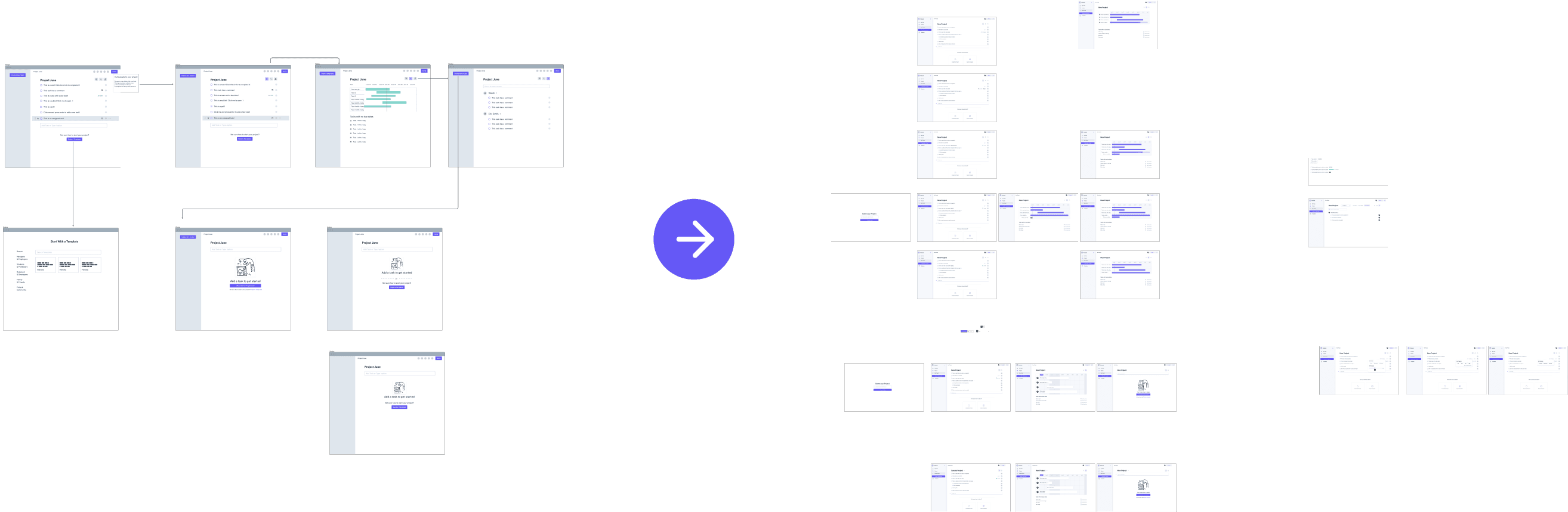
Reducing the number of steps to show value sooner.
Reducing the number of steps to show value sooner.
Since there was a 63% dropoff after the 2nd interaction, I wanted to show users value as soon as possible. Therefore, I reduced the onboarding from 5 steps down to 3 steps.
Since there was a 63% dropoff after the 2nd interaction, I wanted to show users value as soon as possible. Therefore, I reduced the onboarding from 5 steps down to 3 steps.
Before - 5 Steps
Before - 5 Steps
After - 3 Steps
After - 3 Steps
Working With Others
Working With Others
I collaborated with another designer to prototype, test, and iterate the user flow.
I collaborated with
another designer to prototype, test, and
iterate the user flow.
I created lo-fi prototypes and conducted user testing to quickly refine my inital solutions. Once I had established the high-level overview, another designer on the team handled the detailed design. We collaborated on iterating and finalizing the design.
I created lo-fi prototypes and conducted user testing to quickly refine my inital solutions. Once I had established the high-level overview, another designer on the team handled the detailed design. We collaborated on iterating and finalizing the design.
Issue #1: How to Show Value
Issue #1: How to Show Value
We tested 3 different ways to preview templates before users select a template.
We tested 3 different ways to preview templates before users select a template.
Templates were harder for people to understand because they didn't know what the product did and they couldn't see previews. After user testing, we chose the third idea because it was the clearest and only available when the user looked for it.
Templates were harder for people to understand because they didn't know what the product did and they couldn't see previews. After user testing, we chose the third idea because it was the clearest and only available when the user looked for it.

1. Popup Preview
1. Popup Preview
Shows up before project is fully created. It shows a preview but it's not as important
Shows up before project is fully created. It shows a preview but it's not as important

2. Hover Preview
2. Hover Preview
Shows up before project is fully created. Shows preview but it feels like a temporary experience. Seeing previews over takes the screen.
Shows up before project is fully created. Shows preview but it feels like a temporary experience. Seeing previews over takes the screen.

3. Dedicated Preview
3. Dedicated Preview
Popup after the project is created with the preview taking more attention.
Popup after the project is created with the preview taking more attention.
Issue #1: How to Show Value
Issue #1: How to Show Value
Designing a light mode and dark mode for templates.
Designing a light
mode and dark
mode for templates.
We designed a light mode and dark mode to cater to different user preferences and environments. We paid careful attention is given to color choices, typography, and contrast to ensure readability in both modes.
We designed a light mode and dark mode to cater to different user preferences and environments. We paid careful attention is given to color choices, typography, and contrast to ensure readability in both modes.
Light Mode

Dark Mode

Issue #2: How to Show Progress
Issue #2: How to Show Progress
We designed ways to
display project progress
and set user status.
We designed ways to display project progress and set
user status.
We designed ways to
display project progress and set user status.
Since there was a 63% dropoff after the 2nd interaction, I wanted to drive value as soon as possible. I reduced the onboarding flow from 5 steps down to 3 steps.
Since there was a 63% dropoff after the 2nd interaction, I wanted to drive value as soon as possible. I reduced the onboarding flow from 5 steps down to 3 steps.

Low-Fidelity
Low-Fidelity
We came up with many ideas and would pitch them to others for critique and feedback. We guerilla tested the best ideas for usability.
We came up with many ideas and would pitch them to others for critique and feedback. We guerilla tested the best ideas for usability.

High-Fidelity
High-Fidelity
We ended up picking the status setting on the task check because was the simplest solution that performed the best in our guerilla tests.
We ended up picking the status setting on the task check because was the simplest solution that performed the best in our guerilla tests.
Issue #3: Discoverability
Issue #3: Discoverability
I added a sample project as an interactive tutorial to show what tasks users could do.
I added a sample project as an interactive tutorial to show what tasks users could do.
One of the complaints we got was that users didn't know what other features Projectify could offer. We ran into a issue with how to show templates and let users create a project so we conducted a few guerilla tests to find better solutions.
One of the complaints we got was that users didn't know what other features Projectify could offer. We ran into a issue with how to show templates and let users create a project so we conducted a few guerilla tests to find better solutions.
1. Buttons at the top
1. Buttons at the top
I tried placing the button on top but users would skip the tutorial and click the buttons, so learned that it would have to come after they see the sample project.
I tried placing the button on top but users would skip the tutorial and click the buttons, so learned that it would have to come after they see the sample project.

2. One bottom button
2. One bottom button
I tried having one button for templates but it that meant people would have to delete all tasks if they just wanted to create a project.
I tried having one button for templates but it that meant people would have to delete all tasks if they just wanted to create a project.
2. Two bottom buttons
2. Two bottom buttons
This was the best of both worlds. It followed a logical narrative and offers different options for how to build a project. We ended up going with this version.
This was the best of both worlds. It followed a logical narrative and offers different options for how to build a project. We ended up going with this version.
Final Design
Final Design
We redesigned a brand new Projectify landing page.
We redesigned a brand new Projectify landing page.
With feedback I got from testing the existing site, I redesigned the landing page by making it more company focused, adding social proof. My partner created custom illustrations to make it more visually appealing.
With feedback I got from testing the existing site, I redesigned the landing page by making it more company focused, adding social proof. My partner created custom illustrations to make it more visually appealing.

Feedback + Results
Feedback + Results
I conducted a full usability test again with 7 people to measure results.
I conducted a full usability test again with 7 people to measure results.
I wanted to make sure the full onboarding experience worked and improved. We also chose 3 previous testers to see if their experience improved. Here are the results.
I wanted to make sure the full onboarding experience worked and improved. We also chose 3 previous testers to see if their experience improved. Here are the results.

I was so happy with the results. Users who read the sample project were able to understand how to use Projectify and saw the value of the tool. Users who didn't read the sample project were still able to figure it out the features on their own. There were significant improvements on all tasks. Some went from 0% success to 100%. After all of our hard work, we finally saw the monthly active users shoot up!
I was so happy with the results. Users who read the sample project were able to understand how to use Projectify and saw the value of the tool. Users who didn't read the sample project were still able to figure it out the features on their own. There were significant improvements on all tasks. Some went from 0% success to 100%. After all of our hard work, we finally saw the monthly active users shoot up!
What I Learned
Creating a design system from scratch is a lot of work.
Creating a design
system from scratch
is a lot of work.
We really had to get into the nitty gritty of each pixels and ensure style consistency in every component. We spent a lot of time learning how use Figma efficiently to get the most out of the software.
We really had to get into the nitty gritty of each pixels and ensure style consistency in every component. We spent a lot of time learning how use Figma efficiently to get the most out of the software.
01
Projects can get quite messy.
Lots of changes can make a project very messy and impact the final results. Each change should be intentional by pairing it with a metric we want to improve. It's important to rename and organize files for dev hand off. They should have easy access to assets and know exactly what changes they have to make.
02
Be specific in your designs.
Be careful of padding and margins. Developers won't know what values to set if you don't specify. Take out the guess work by being as precise as possible or else the end result will looks different from your pixel-perfect designs.
02
Be specific in your designs.
Be careful of padding and margins. Developers won't know what values to set if you don't specify. Take out the guess work by being as precise as possible or else the end result will looks different from your pixel-perfect designs.
Explore Other Work
Explore Other Work

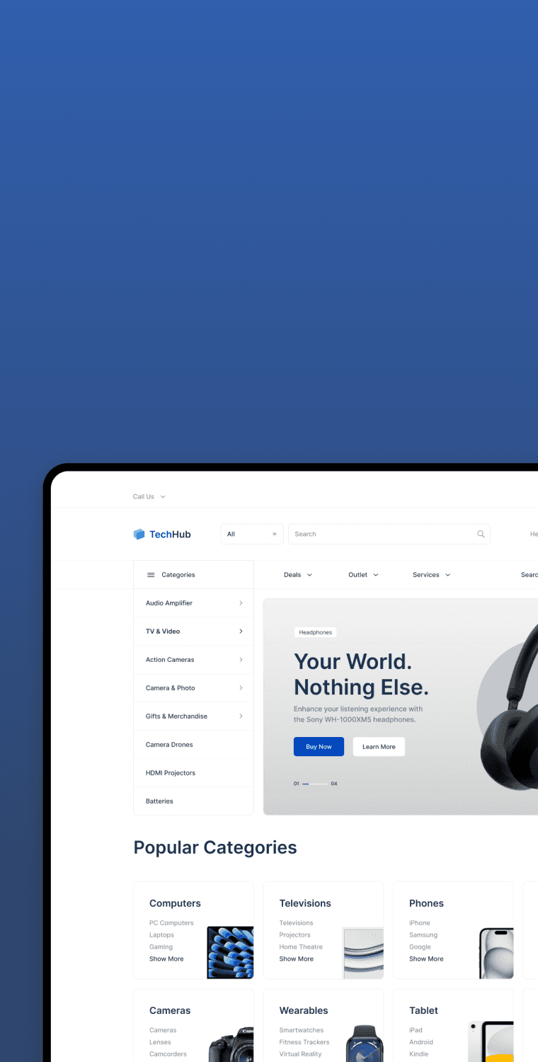
TechHub · Web Design
How Can We Increase Conversion Rates?
TechHub is an e-commerce website designed to provide a seamless experience shopping electronic gadgets online.

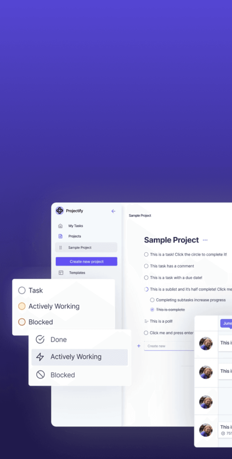
Projectify · Web Design
How Can We Optimize Web App Onboarding?
I investigated why there was a 32% drop in monthly active users, 85% bounce rate, and a stagnant 20% sign-up rate.
FinPay · App Design
How Can We Make Payments Easier?
FinPay is a concept app that enables users to seamlessly send and receive payments, make purchases, and track transactions.
TV Guide · App Design
How Can We Improve Movie Discovery?
TV Guide is the ultimate destination to easily and quickly discover what, when, and where to watch, anytime, anywhere.
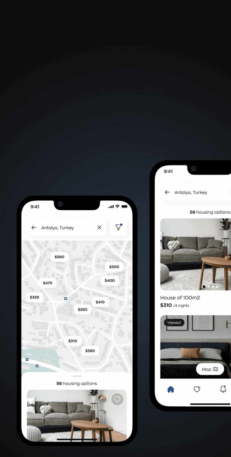
Homeline · App Design
How Can We Simplify The Booking Process?
Homeline is a concept app that allows people to easily to search and book rooms, apartments, and places all over the world.

Caremerge · App Design
Connecting Family To Senior Care Providers.
Caremerge connects family members to care providers so they can check up on their loved ones in senior care.

School Apply · Web Design
Helping Students Land Their Dream Schools.
School Apply helps students find, compare, and apply to any school or program around the world with consultation and support.
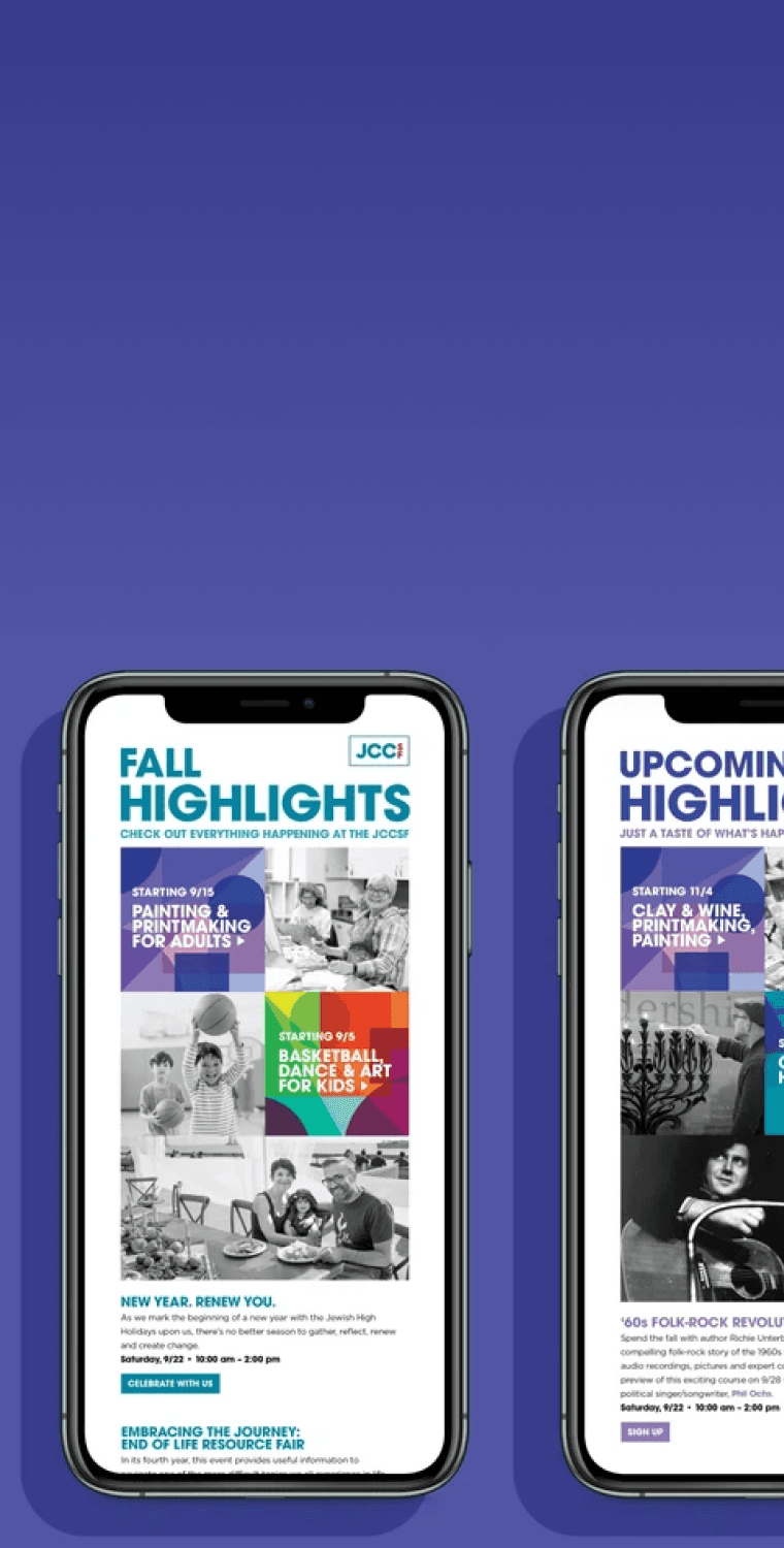
JCCSF · Email Design
How Can We Increase Email Engagement?
I designed and optimized JCCSF's email campaign template to increase clickthough rate and subscriber engagement.
TechHub · Web Design
How Can We Increase Conversion Rates?
TechHub is an e-commerce website designed to provide a seamless experience shopping electronic gadgets online.
Projectify · Web Design
How Can We Optimize Web App Onboarding?
I examined why there was a 32% drop in monthly active users, 85% bounce rate, and a 5% sign-up rate after a UI update.
FinPay · App Design
How Can We Make Payments Easier?
FinPay is a concept app that enables users to seamlessly send and receive payments, make purchases, and track transactions.
Homeline · App Design
How Can We Simplify The Booking Process?
Homeline is a concept app that allows people to easily to search and book rooms, apartments, and places all over the world.
TV Guide · App Design
How Can We Improve Movie Discovery?
TV Guide is the ultimate destination to easily and quickly discover what, when, and where to watch, anytime, anywhere.
Caremerge · App Design
Connecting Family To Senior Care Providers.
Caremerge connects family members to care providers so they can check up on their loved ones in senior care.
School Apply · Web Design
Helping Students Land Their Dream Schools.
School Apply helps students find, compare, and apply to any school or program around the world with consultation and support.
JCCSF · Email Design
How Can We Increase Email Engagement?
I designed and optimized JCCSF's email campaign template to increase clickthough rate and subscriber engagement.