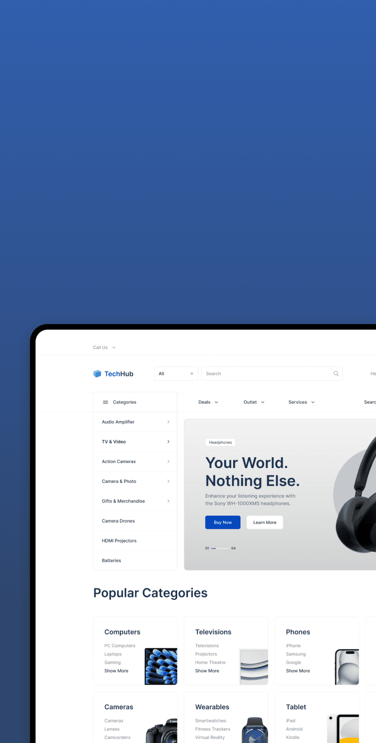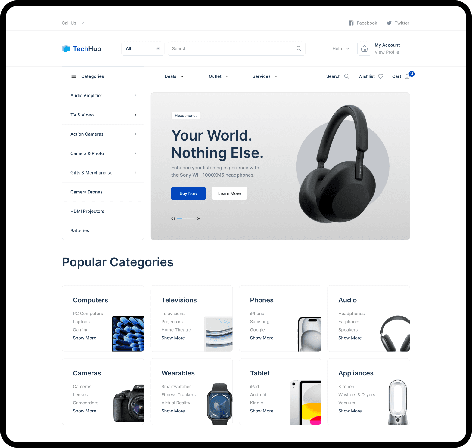
Navigation Menu
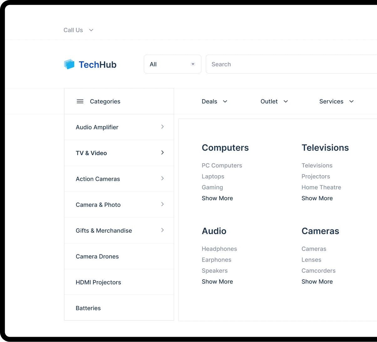
Product Categories

Ensuring clear hit areas in visual elements.

Ambiguous hit areas.
If the number or destination of hit areas are unclear, as they are on 33% of sites, testing has shown that users can experience unnecessary disruption or disorientation.
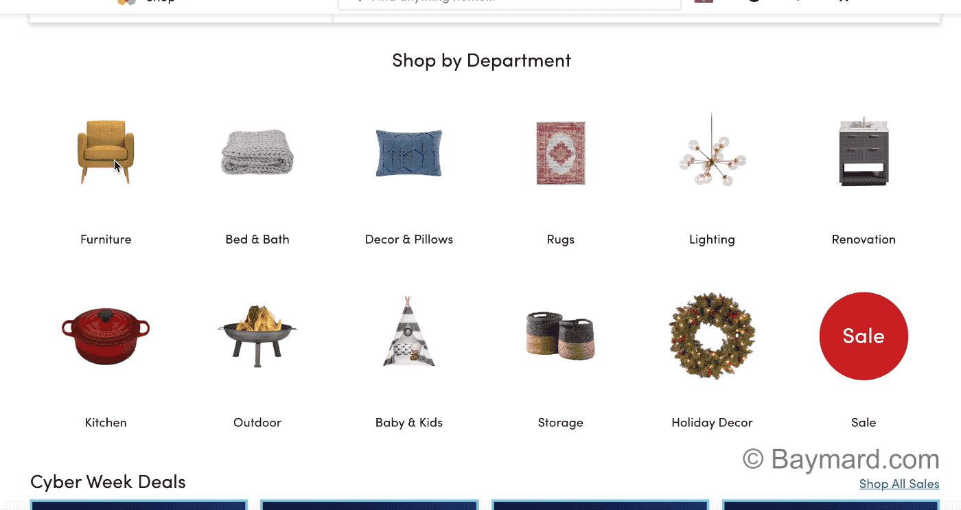
Clear hit areas.
On Wayfair, it’s clear that both the titles and thumbnails of subcategory links lead to the same place because of a synchronized hover area.
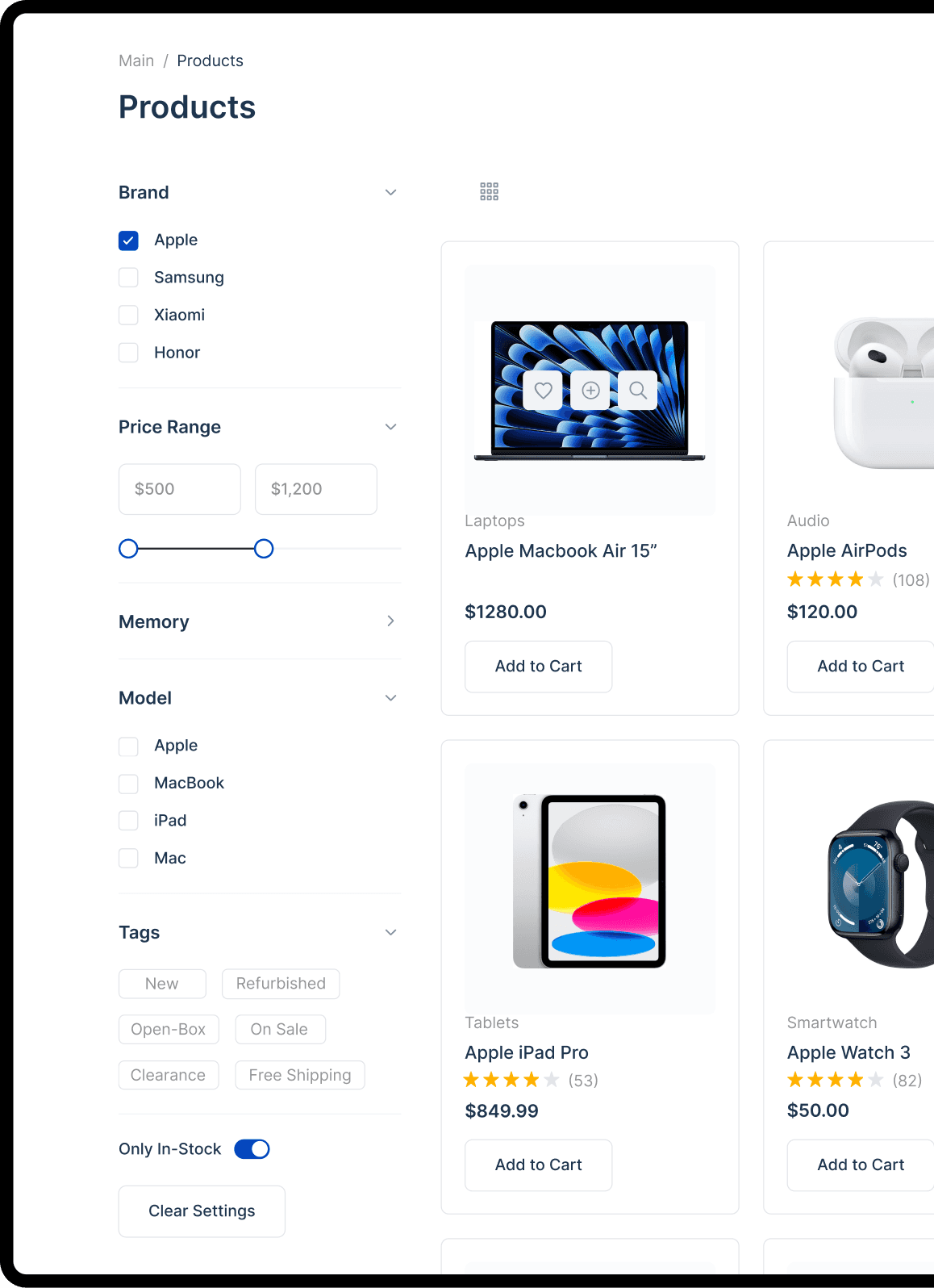
Search Filters

Using separate subcategories.
“One-of-a-Kind Rugs” and “Area Rugs” are separated into distinct categories at Wayfair, even though their attributes are identical. As a result, users won’t be able to easily compare all rugs that might be suitable.

Using attribute filters.
Because attributes such as “Sleeping Bag Shape” and “Insulation Type” are implemented as filters rather than separate categories, users on can view all similar products together, and explore filter options until they find a suitable product.
Including the number of reviews along with the star rating.

Excluding the number of reviews.
At Sears, there’s no comparison feature. Users must rely on the product list and product page to compare items — which is typically inefficient and challenging for users.

Including the number of reviews.
Being able to see the number of user ratings in list items, as seen on Argos UK, increases trust in both the ratings and the site, and help users assess the ratings of others at a glance.
Product Page
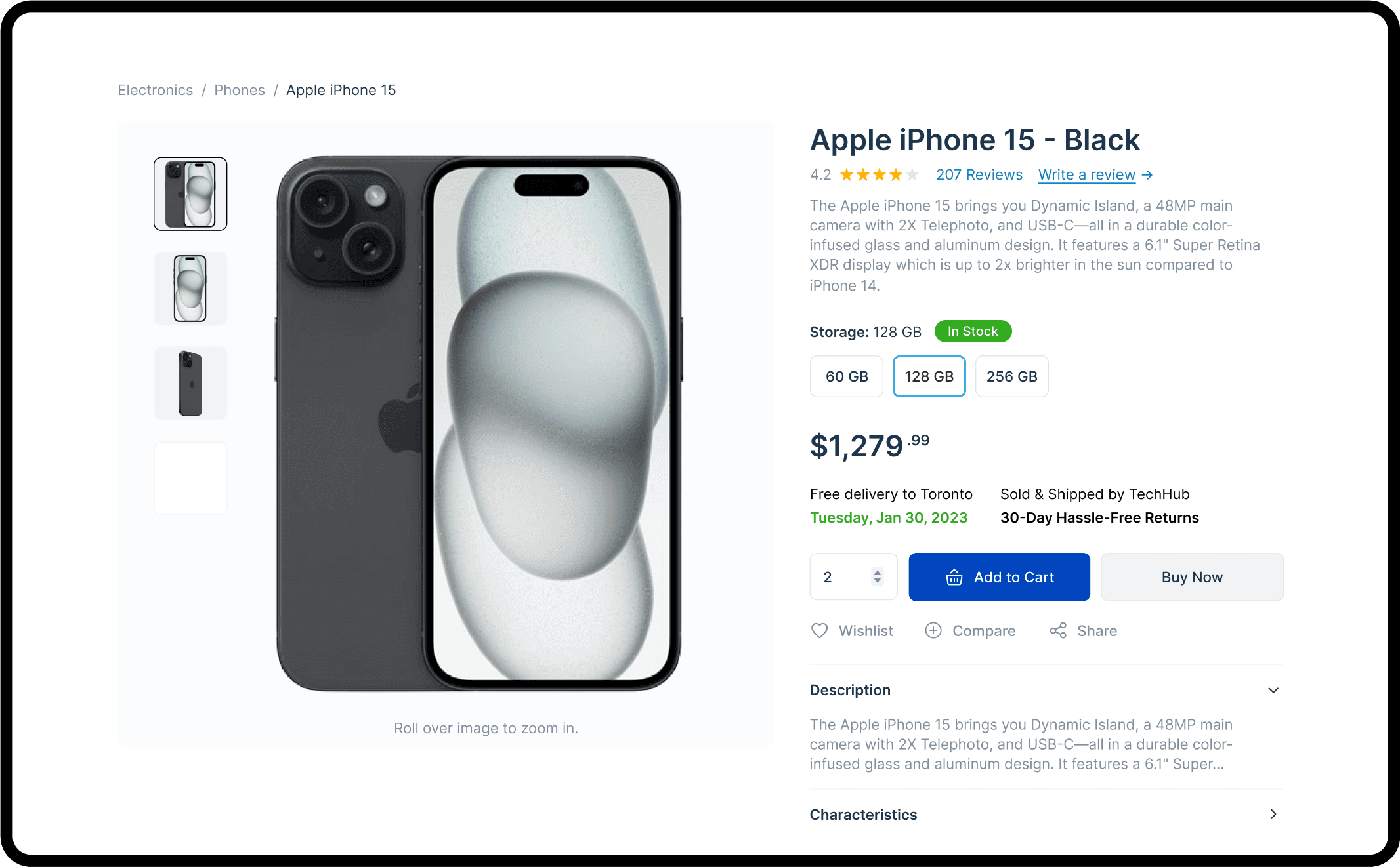
Using thumbnails to represent additional product images.

No product thumbnails.
Using indicators to represent product images makes it unnecessarily difficult for users to click on or find the images they are interested in.

With product thumbnails.
Using thumbnails allows users to quickly decide which images they’d like to see, and then jump to those specifically.
Providing human models or lifestyle shot for scale comparison.

No human model image.
Users had trouble judging the size of the North Face backpack at Nordstrom because there were no images showing it on a model.
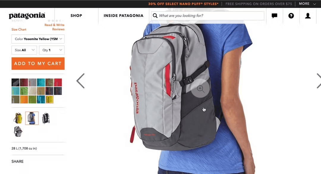
With human model image.
On the other hand, by showing the backpack on a model, Patagonia provided users with a good sense of its relative size. “I like that they show it on a person, it gives a good sense of scale”.
Product Information

Providing detailed product descriptions.

Brief product description.
A user at Staples added an office chair to her cart for later comparison. However, she found the product description to be too brief upon closer inspection. Insufficient product descriptions can make users hesitant to purchase the item.

Detailed product description.
Looking at another office chair at Staples, the same user found the more detailed description for this chair to be better than the limited information on another chair. Consequently, she discarded the previous chair in her cart.
Creating product descriptions using highlights.
Text block or bullet points.
A subject at Tesco found a product description intimidating. Users rarely look forward to reading text blocks that have a “wall of text” appearance.

Product highlights.
Newegg helps users to slow down and focus on a phone’s unique features. Many users would skip over such features if they were simply included in a text block or bullet list.
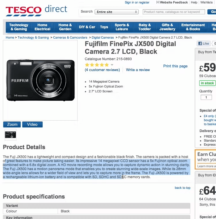
Making product specifications more scannable for users.
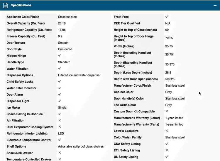
Not organized in sections.
Multiple test subjects had issues identifying core attributes of a fridge at Lowe’s — in particular the specs for size and warranty information. Note how the two-column spec sheet is simply one long ungrouped list of specs.
Organized in sections.
On the other hand, Tesco sematically groups specs into sections, making the long spec sheet much easier to get an overview of and allowing users to quickly access specs they’re looking for.
Product Recommendations
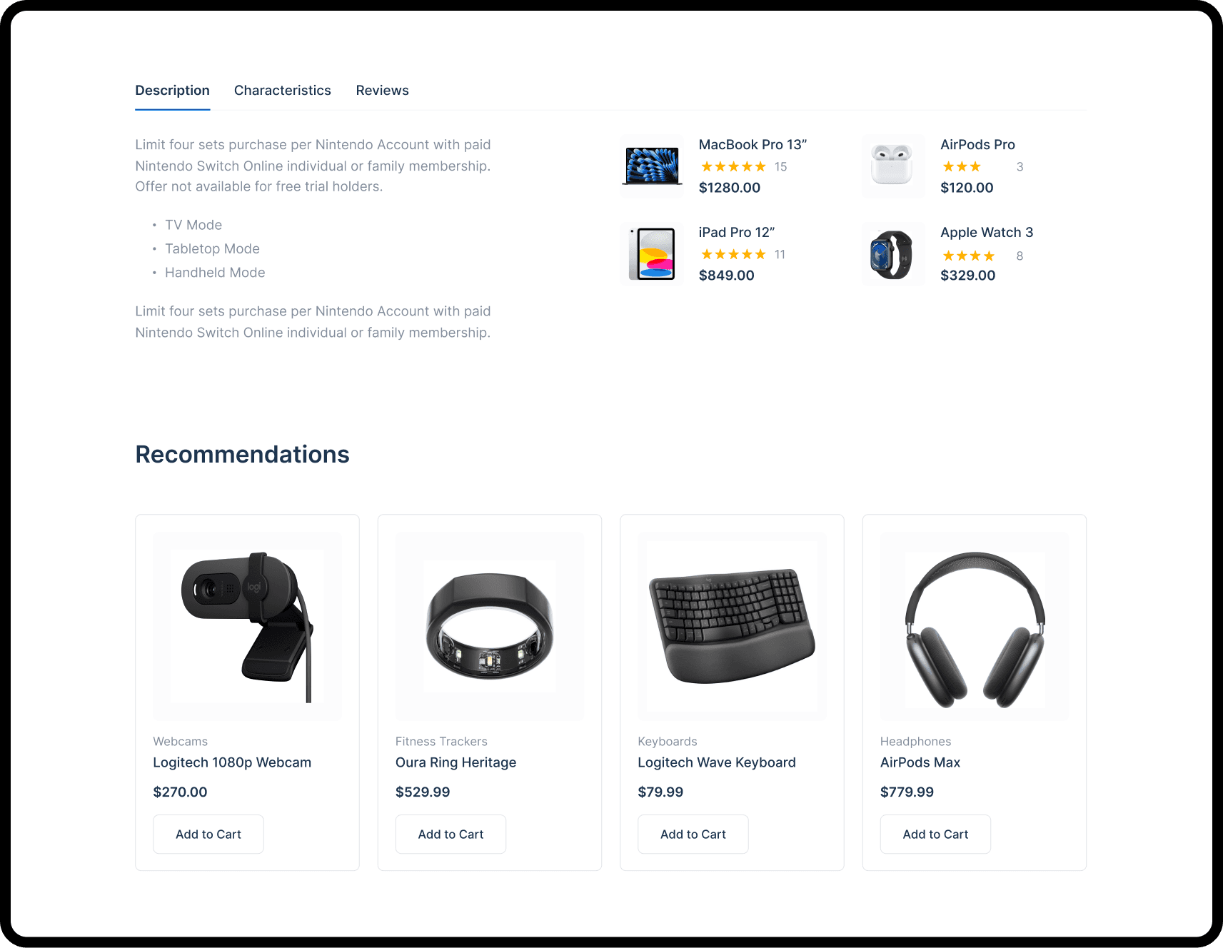

Only suggesting alternative products.
The test subject wanted to find shoes to complete her outfit, but Gilt only provided alternative product suggestions for dresses, not supplementary items like shoes or accessories.

Including supplementary product suggestions.
Newegg's diverse product suggestions show that they sell more than just cameras. The suggested accessories span different categories, including lenses, memory cards, tripods, and backpacks.
Customer Reviews

Providing star rating distributions for reviews.

Using only star ratings.
Lowe’s provides a rating summary but, by not offering a graphical representation of the distribution of ratings, users can’t quickly scan the summary to get a visual impression of how well or poorly rated the product actually is.
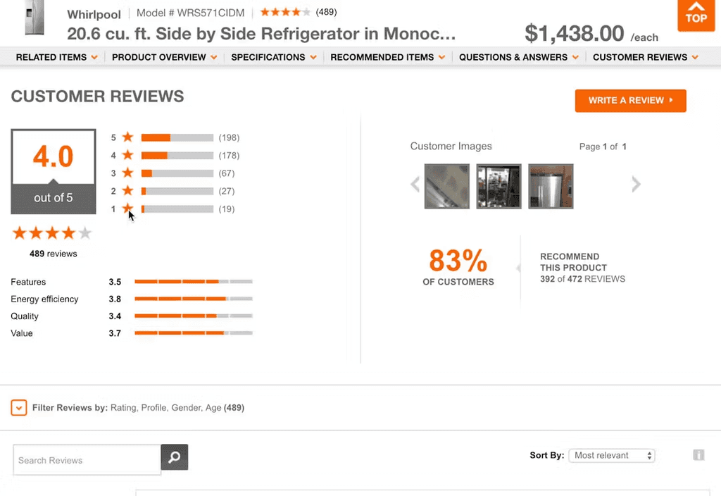
Using rating distributions.
At Microsoft a bar chart is used to allow users to understand the ratings distribution at a quick initial glance. Furthermore, it’s clear that the rating bars are clickable. When hovered, the entire bar is highlighted with a grey background color and the mouse cursor changes to the hand icon.
Product Comparison
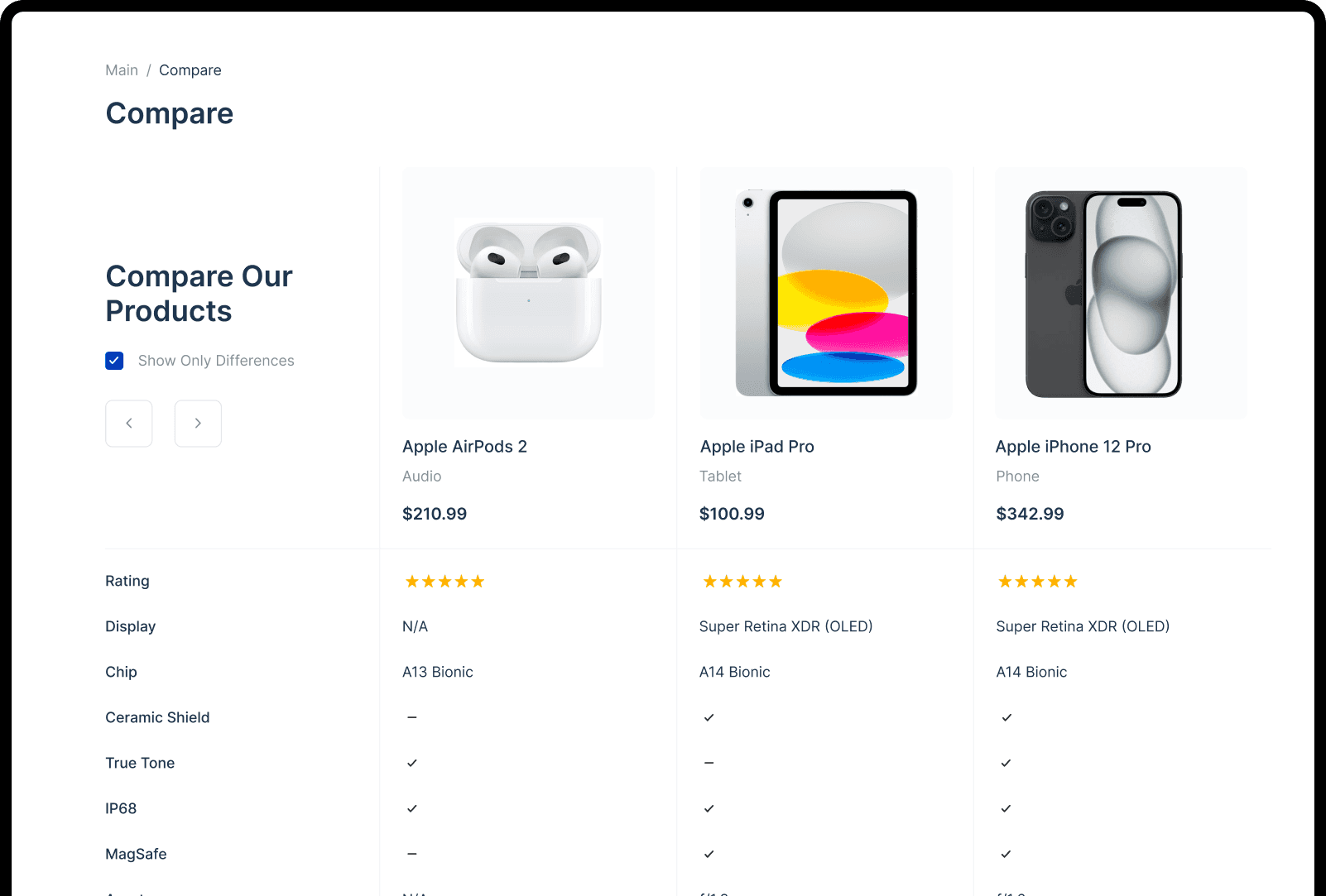
Providing comparison features for spec-driven products.

No comparison feature.
At Sears, there’s no comparison feature. Users must rely on the product list and product page to compare items — which is typically inefficient and challenging for users.
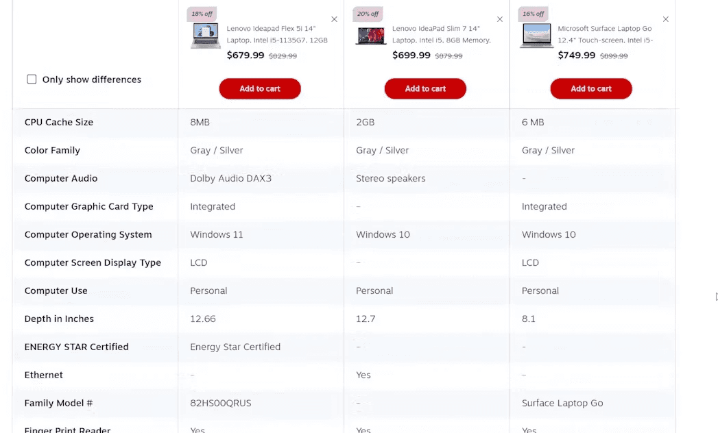
Having a comparison feature.
Comparing the specs and features of different laptops on Staples like battery life, graphic processor, hard drive size is helpful and made it easier to make a purchase decision.
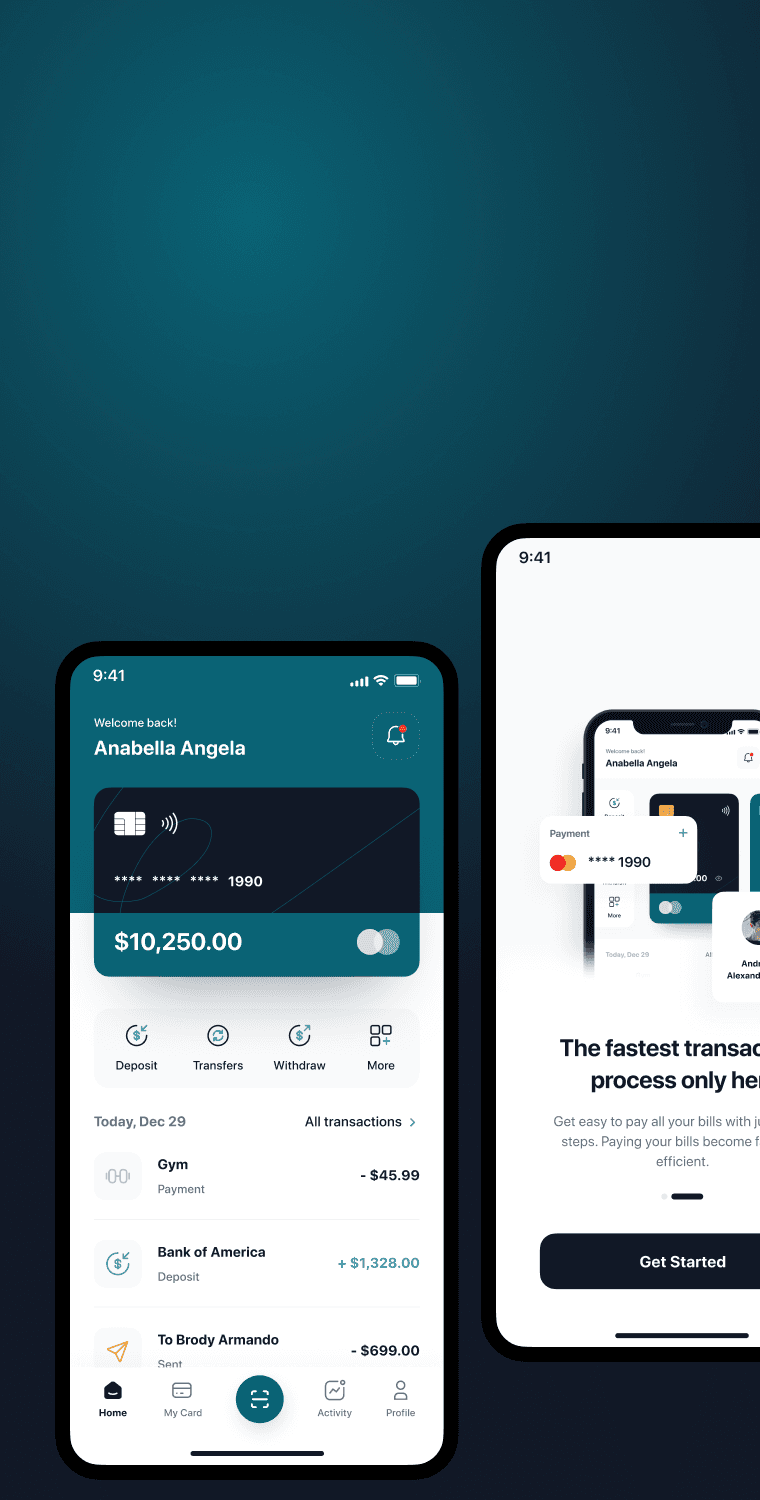
Wishlist
Personalized wishlist for easy product saving. Quick add/remove functionality for effortless management.

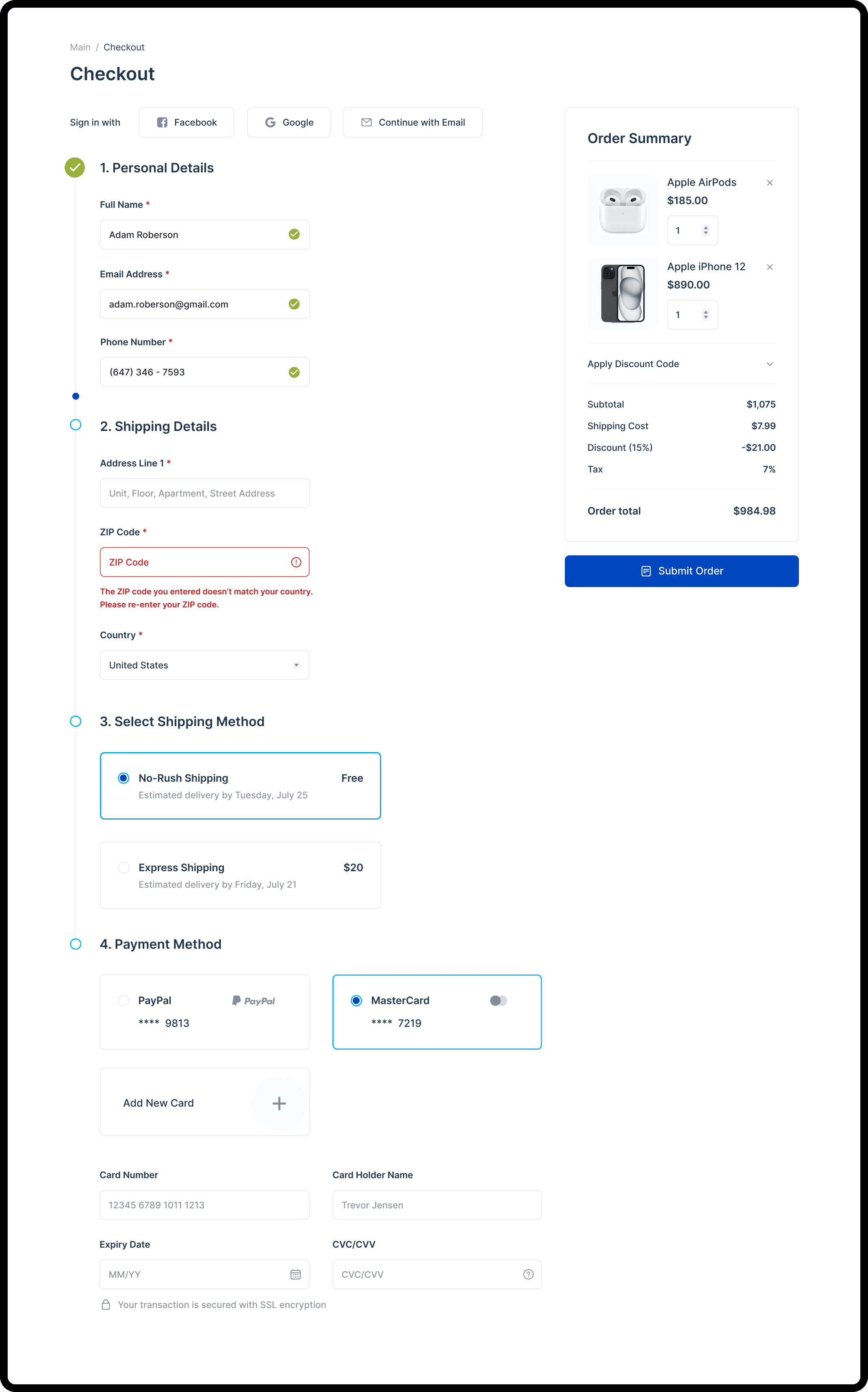
Order Review
Clear product summary for order review. Prominent call-to-action to hassle-free checkout.

Checkout Page
Simplified checkout for seamless purchases. Secure payment options for peace of mind. Clear order summary and confirmation for review.
Helping users catch input errors early on with inline validation.
Validation after form submission.
Only showing errors to users when they’ve tried to submit a form can be a recipe for abandonment. Also avoid premature validation and remove error messages when an input is corrected.

Inline validation while filling form.
By alerting a user to an error immediately via inline validation, the user can save time and effort by quickly correcting the input and moving forward with checkout.
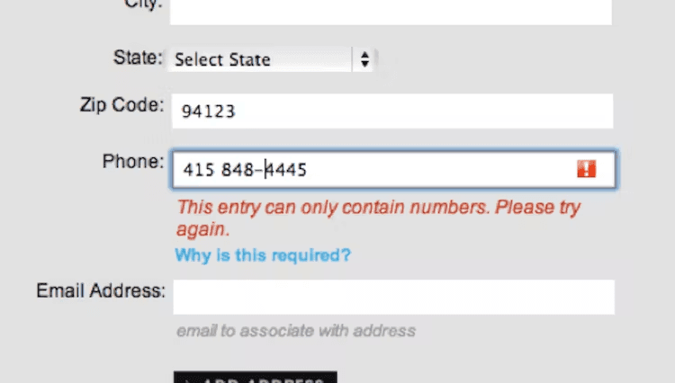
Avoiding generic error messages that are unhelpful.

Generic error message.
The generic error message at GameStop suggests that the issue is that users have not entered a phone number — when the real issue is the phone number is incomplete and does not have enough digits to be valid.
Specific adaptive error message.
By avoiding generic error messages and providing specific and adaptive error feedback, users can quickly make the appropriate changes and reduce customer frustrations.
Using placeholders and examples to clarify formatting.

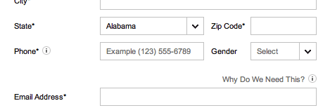
Clear phone number format and example placeholders.
Combined with inline validation, using placeholders and providing examples of formatting can help users understand the correct input.
Using a single-column layout for user's smooth visual flow.


Confusing multi-column form.
The multi-column form layout at Staples risks users missing fields as they scan back and forth across the form. This layout is prone to ambiguity because users’ attention is drawn in multiple different directions, increasing the risk that users will complete the form incorrectly.

Clear single-column form.
At Debenhams, a single-column layout for address forms supports users’ preference to fill and scan information in one direction. This also leaves room for other crucial information, such as the running order summary and cart details.
Optimizing checkout flow from 16 to 8 form fields.


Reducing the number of form fields to reduce effort and friction to checkout.
In checkout optimization, the number of form fields matters more to users than the total checkout steps. By optimizing the checkout flow, we reduced the common form fields from 16 to 8, allowing users to proceed smoothly and place their orders with minimal friction.
Consolidating names to a single “full name” field.
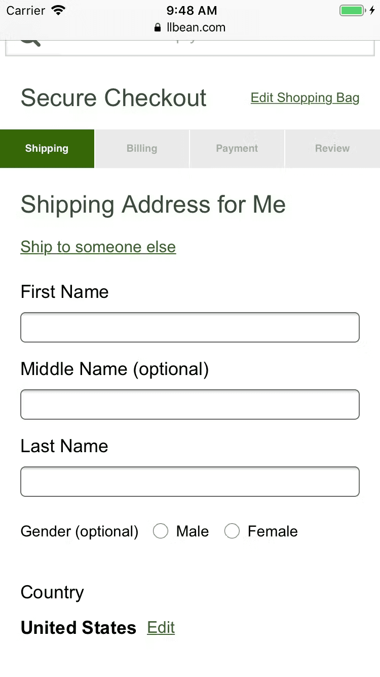
Having two name fields.
In checkout usability tests, users often enter their full name in the "First Name" field, considering their name as a single entity. This unnecessary friction occurred with 42% of test users, which is significant given the simplicity of the task.
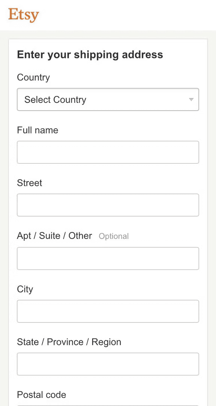
Having a single name field.
At Etsy, a “Full name” field is provided, simplifying the task of “type your name” for users. They acknowledged users’ tendency to think of their name as a single entity by implementing a single “Full Name” field.
Hiding "Address Line 2", "Company", and "Coupon" fields.

Having two address fields.
During testing, 30% of users encountered friction at "Address Line 2" and questioned the correctness of their "Address Line 1" input. Coupon codes caused even more disruption, with some users leaving the site to Google for codes.

Having a single address field.
At Etsy, a “Full name” field is provided, simplifying the task of “type your name” for users. They acknowledged users’ tendency to think of their name as a single entity by implementing a single “Full Name” field.
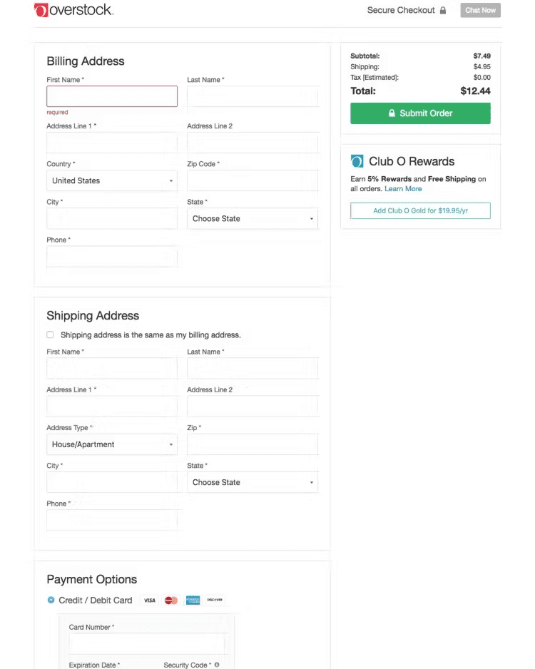
Hiding "Billing Address" field.
Having shipping and billing fields.
At Overstock the default is to use different shipping and billing addresses, resulting in needlessly many form fields being presented on the page.
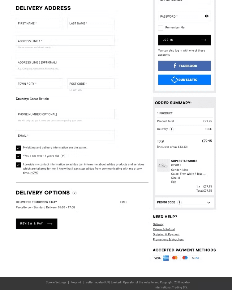
Having only shipping fields.
At Adidas, the “Billing Address” fields are hidden by default. The subgroup of users who need a separate billing address simply have to uncheck the checkbox to be provided with those fields.
Account Information


82%
We found that 82% of user examine product descriptions and specifications before making their purchase.
Source: Statista
68%
A study found that 68% of shoppers prioritize customer reviews and ratings in their decision-making process.
Source: Barclay Study (UK)
57%
Comprehensive
Search Filters
Data analysis revealed that 57% of consumers value search filters to quickly narrow down their search.
Source: Netguru Survey

How often do you shop for electronics online?
How important is the design of the website?
How do you search for specific products?
How do you assess the credibility of sellers or brands?
How do you choose the right product?
How do customer reviews influence your purchase decision?
What challenges do you face when checking out?
What payment methods do you use?

"I always look for detailed product information and user reviews to make a purchase decision."
- Devin Swan

"I like to search for products based on categories and filters to narrow down what I am looking for."
- Sofia Azevedo

"With so many products from different brands to choose from, having a comparison feature is super helpful."
- Alex York

"I like to browse around but I usually don't buy it right away, so having a wishlist is super useful for purchasing later."
- Victor Zhulin


Strengths
Weaknesses
Hook the visitor's attention when they first land on the website.
Keep them on the platform by engaging their desires and interests.
Give them an irresistible offer, and convert them into a paying customer.
A positive shopping experience will make them return back for future purchases.


Style Guide
Aa
Inter
A B C D E F G H I J K L M N O P Q R S T U V W X Y Z
a b c d e f g h i j k l m n o p q r s t u v w x y z
1 2 3 4 5 6 7 8 9 0
#0046BE
#34C4FF
#0FA9E8
#1E354E
#828D9E


Reflection
Next Steps