
Designing a consistent web and mobile design system.
Designing a consistent web and mobile design system.
I helped develop a robust web design system and laid the groundwork for the PayMint web and mobile app design.
I helped develop a robust web design system and laid the groundwork for the PayMint web and mobile app design.
Industry
FinTech
Role
UI/UX Designer
Timeline
6 Months
Tools
Figma
Overview
Overview
What is PayMint?
What is PayMint?
PayMint lets anyone quickly receive and send money from their mobile devices. In addition to mobile banking, PayMint also offers the option to purchase stocks and Bitcoin through its platform.
PayMint lets anyone quickly receive and send money from their mobile devices. In addition to mobile banking, PayMint also offers the option to purchase stocks and Bitcoin through its platform.

The Problem
The Problem
Inconsistent design system.
Inconsistent design system.
PayMint didn't have consistent web design system. It was using a mix of mobile and web styles which caused many issues. I initiated the project, established the web design system, cultivated relationships, and implemented a functional model within the platform.
PayMint didn't have consistent web design system. It was using a mix of mobile and web styles which caused many issues. I initiated the project, established the web design system, cultivated relationships, and implemented a functional model within the platform.

The Solution
The Solution
Establish a consistent
design system.
Establish a consistent
design system.
I proactively engaged with company members to understand their work, pain points, and how the design system team could assist them. Through these conversations, I uncovered various interconnected issues that were tied to a common problem.
I proactively engaged with company members to understand their work, pain points, and how the design system team could assist them. Through these conversations, I uncovered various interconnected issues that were tied to a common problem.
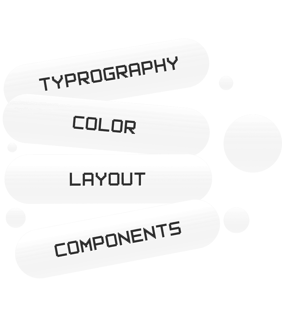
Design System
Design System
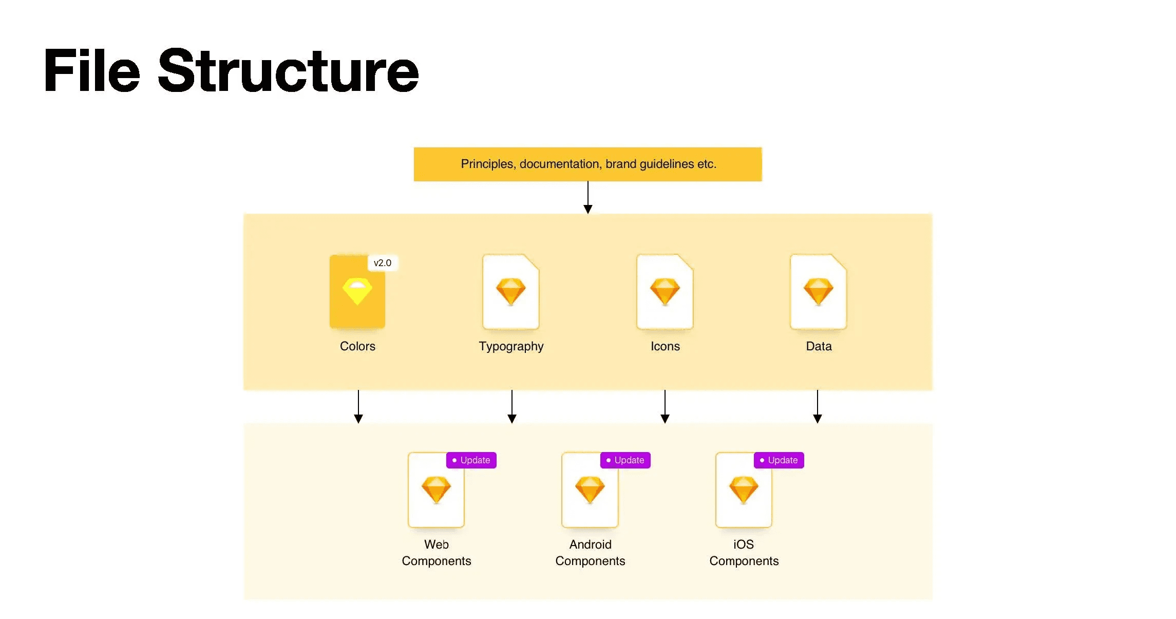
Anatomy of a Design System
Anatomy of a Design System
The design system comprised of design principles, brand guidelines, visual elements, and UI components. It provides PayMint with guidelines for consistent and efficient design, promoting brand cohesiveness and scalability.
The design system comprised of design principles, brand guidelines, visual elements, and UI components. It provides PayMint with guidelines for consistent and efficient design, promoting brand cohesiveness and scalability.

Web Typography
Web Typography
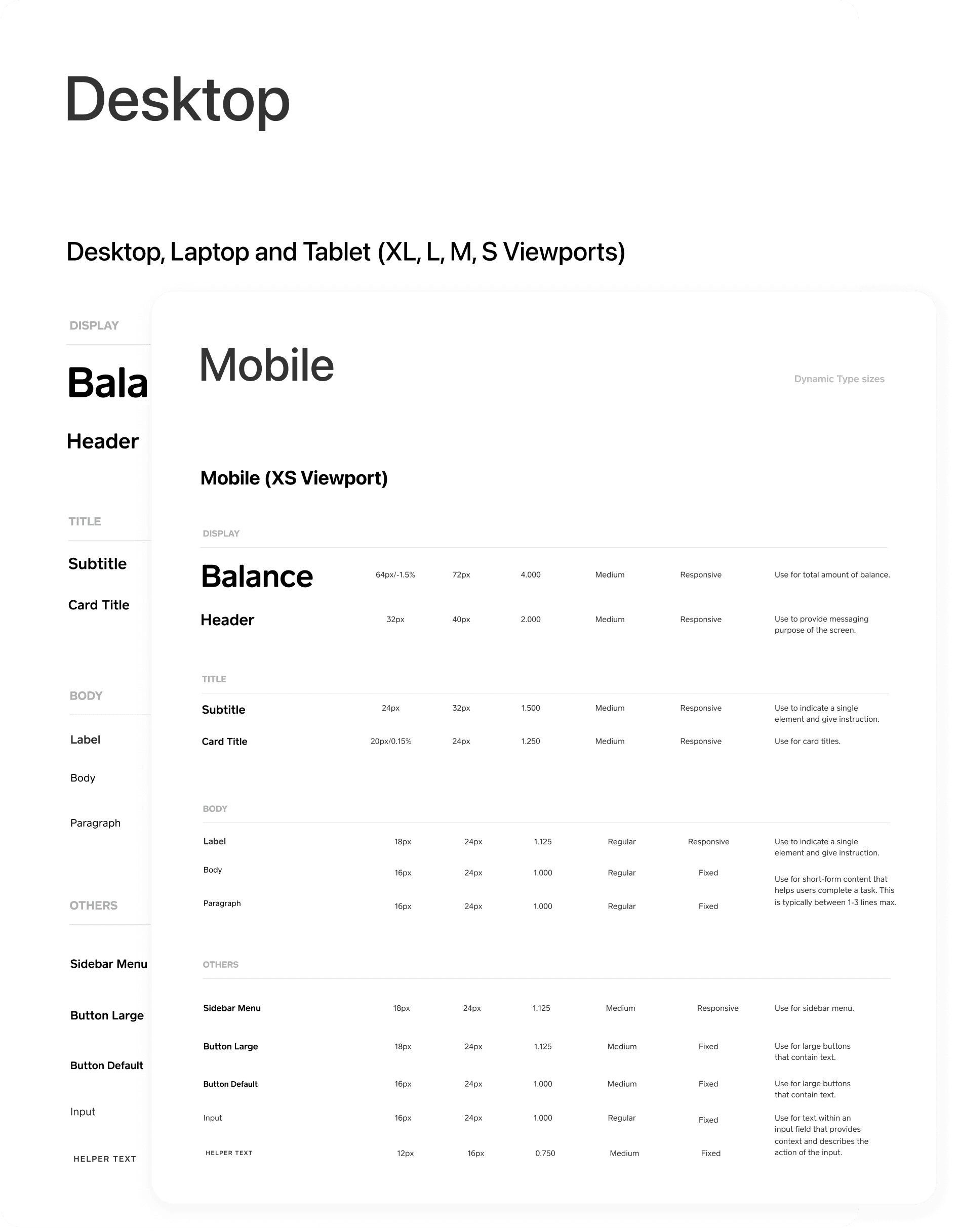
Typography System
Typography System
PayMint had a mobile typography system in place but it lacked a corresponding web typography system. To address this, I examined the existing mobile typography system and applied its principles to create a web typography system using semantic tokens.
PayMint had a mobile typography system in place but it lacked a corresponding web typography system. To address this, I examined the existing mobile typography system and applied its principles to create a web typography system using semantic tokens.
Designed an typography system that supports 5 languages, English, Japanese, Chinese, Thai, and Korean. For each language, I set different system font that easy to develop and fit per mobile operating system
Designed an typography system that supports 5 languages, English, Japanese, Chinese, Thai, and Korean. For each language, I set different system font that easy to develop and fit per mobile operating system

Font values generated using a modular type scale while setting up for a Design System for a multi-platform experience. The document contains a comprehensive list of font sizes, line heights and weights etc. for various breakpoints – handed off as part of collaboration with engineers for easy implementation.
Font values generated using a modular type scale while setting up for a Design System for a multi-platform experience. The document contains a comprehensive list of font sizes, line heights and weights etc. for various breakpoints – handed off as part of collaboration with engineers for easy implementation.

Colors
Color Guide
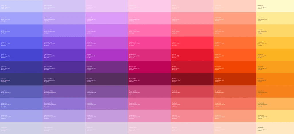
I collaborated with the team to developing a comprehensive color guide. By carefully selecting and documenting colors, their corresponding values, and usage guidelines, the color guide ensures consistency across all design elements.
I collaborated with the team to developing a comprehensive color guide. By carefully selecting and documenting colors, their corresponding values, and usage guidelines, the color guide ensures consistency across all design elements.
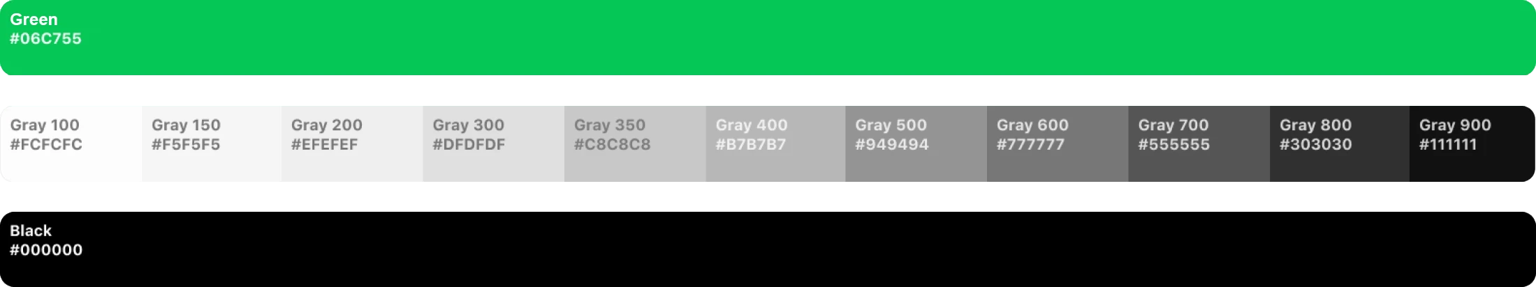
Rainbow color
We created rainbow colors could be used for additional UI elements that do not directly affect the brand experience, but can be used with various colors.
We created rainbow colors could be used for additional UI elements that do not directly affect the brand experience, but can be used with various colors.

Components
Components
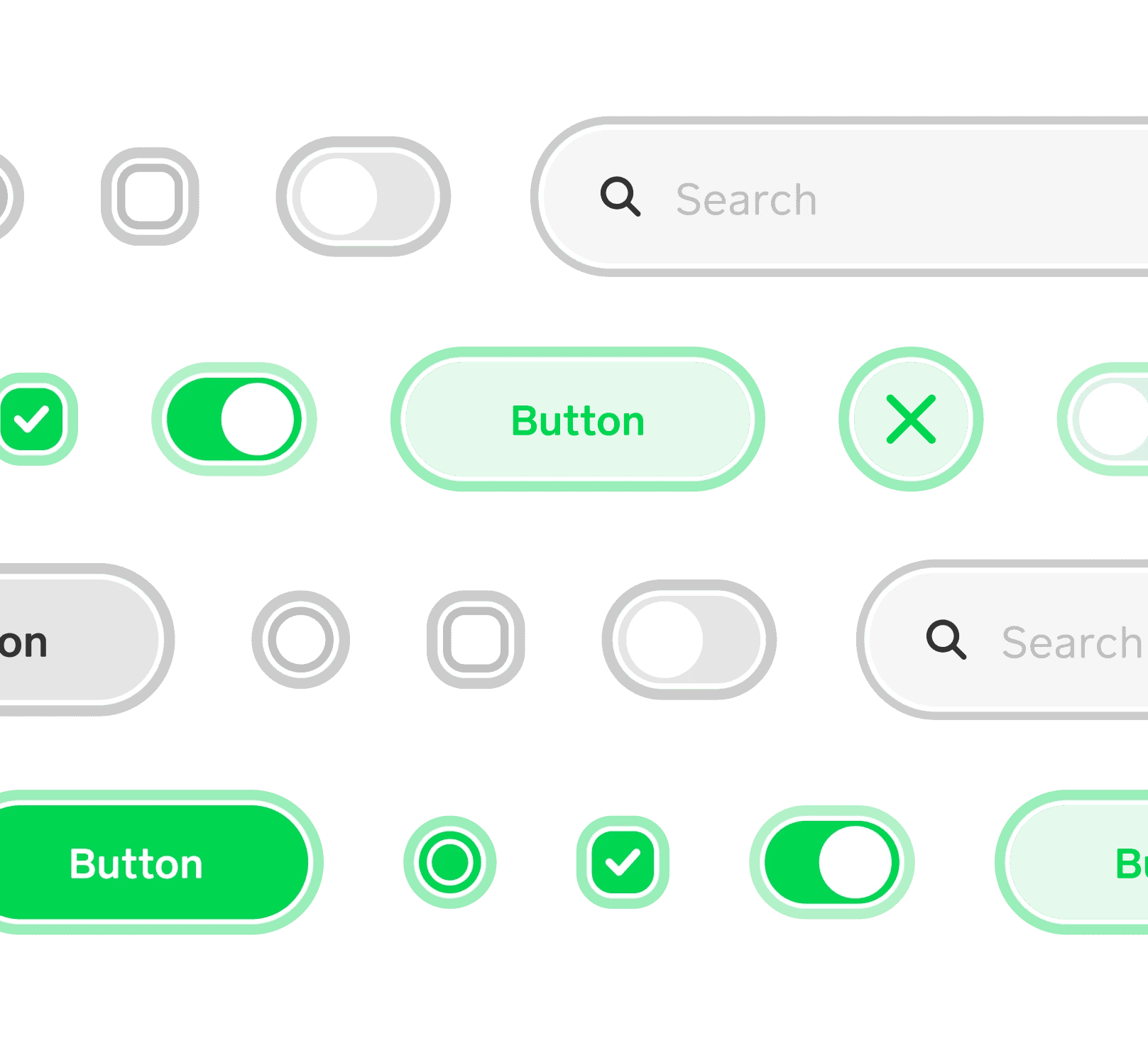
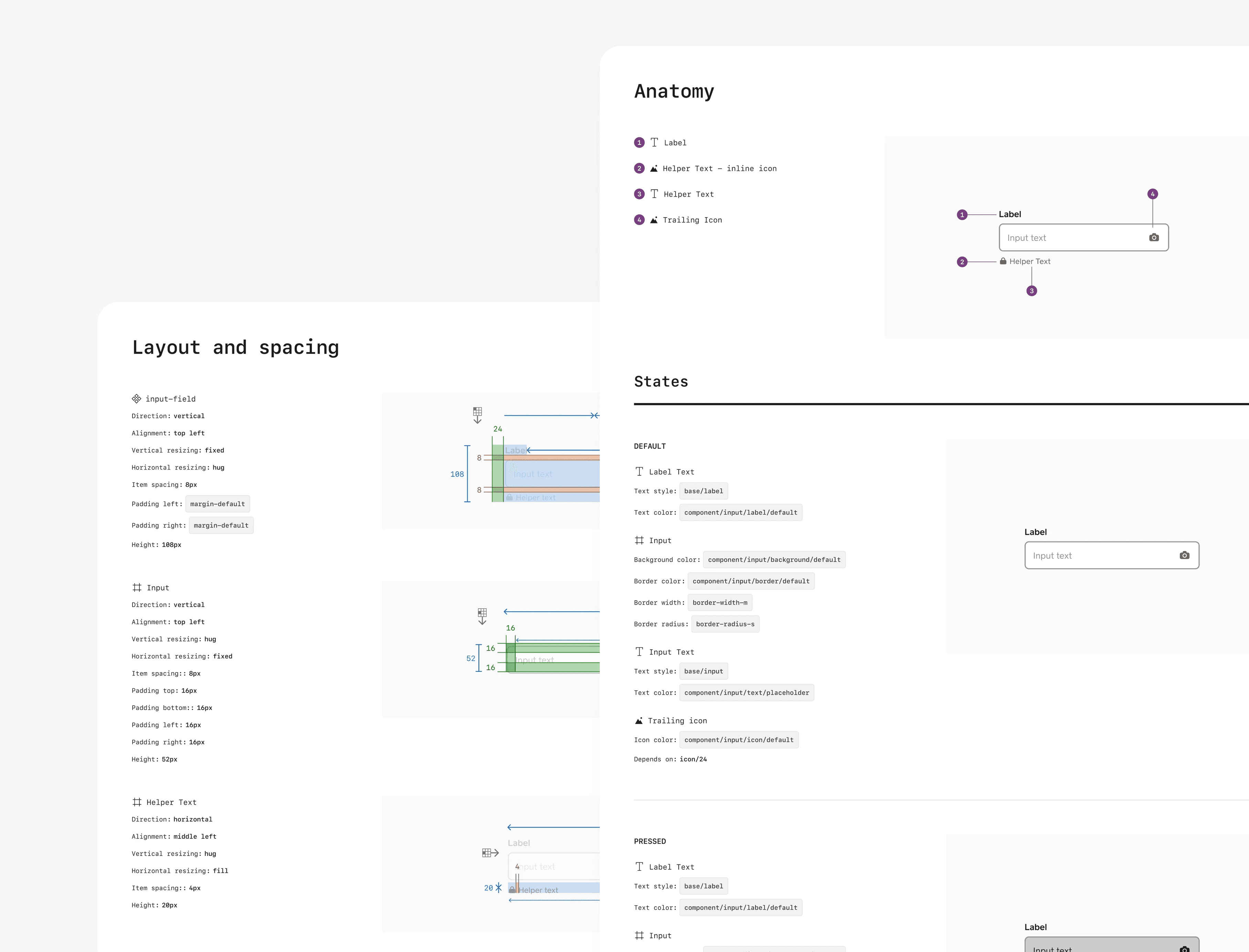
States
States
I designed the states for web components and developed a layout system that could be applied to these components, including hover and focus states.
I designed the states for web components and developed a layout system that could be applied to these components, including hover and focus states.
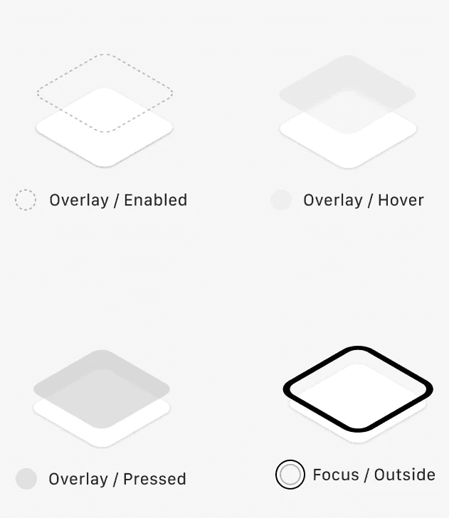
Usability
Focus States
Focus States
I created inclusive focus states that can be universally applied to interactive components, improving accessibility and usability across the platform.
I created inclusive focus states that can be universally applied to interactive components, improving accessibility and usability across the platform.
Layout
Layout
Responsive Grid System
Responsive Grid System
I created a responsive grid system for the PayMint web platform for various viewports and breakpoints. This system enabled seamless responsive design for both screens and individual components.
I created a responsive grid system for the PayMint web platform for various viewports and breakpoints. This system enabled seamless responsive design for both screens and individual components.


Visual Identity
Visual Identity
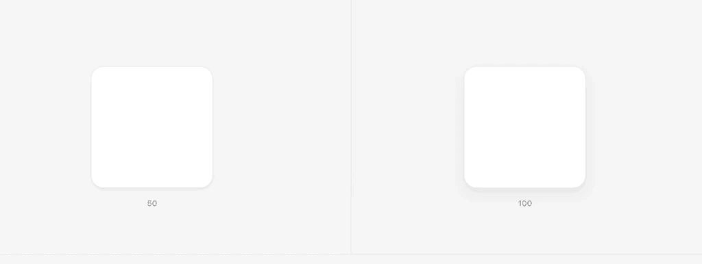
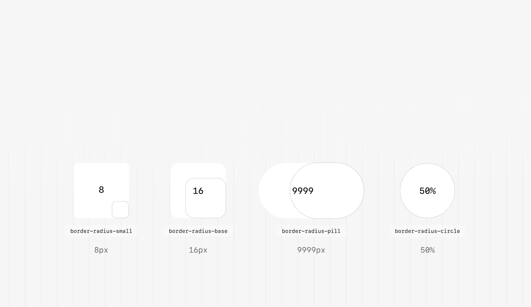
Core Styles
Core Styles
Shapes, border radius, and shadows played a vital role in establishing our foundational visual brand identity. During this phase, I collaborated closely with the creative team to ensure alignment and cohesiveness with their visual identity.
Shapes, border radius, and shadows played a vital role in establishing our foundational visual brand identity. During this phase, I collaborated closely with the creative team to ensure alignment and cohesiveness with their visual identity.
Hierarchy
Hierarchy
Logical Z-Index
Logical Z-Index
In the web platform, we encountered a z-index issue where layers were not organized systematically or in the correct order. To address this, I collaborated with the team to implement proper z-index values, ensuring a responsive and logical arrangement of layers.
In the web platform, we encountered a z-index issue where layers were not organized systematically or in the correct order. To address this, I collaborated with the team to implement proper z-index values, ensuring a responsive and logical arrangement of layers.

UI Components
UI Components
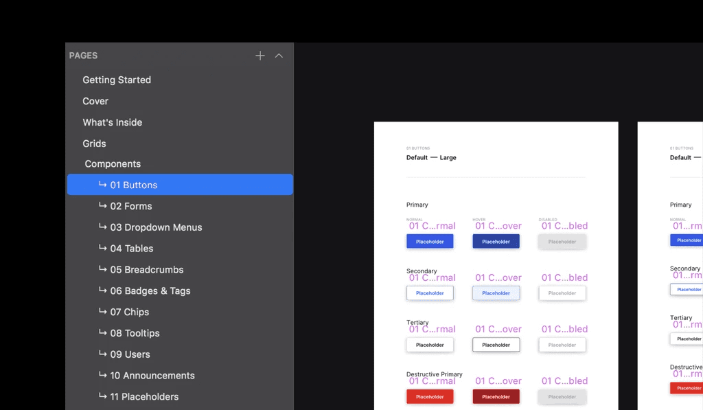
Web Components
Web Components
UI Components are the core part of the design system. Building a reusable component library enhanced product development workflow by reducing technical debt and speeding up the process.
UI Components are the core part of the design system. Building a reusable component library enhanced product development workflow by reducing technical debt and speeding up the process.


Framework
Framework
Documentation
Documentation
I also contributed to the documentation for both our components and foundations, helping the team establish a structured framework that benefits both engineers and designers.
I also contributed to the documentation for both our components and foundations, helping the team establish a structured framework that benefits both engineers and designers.
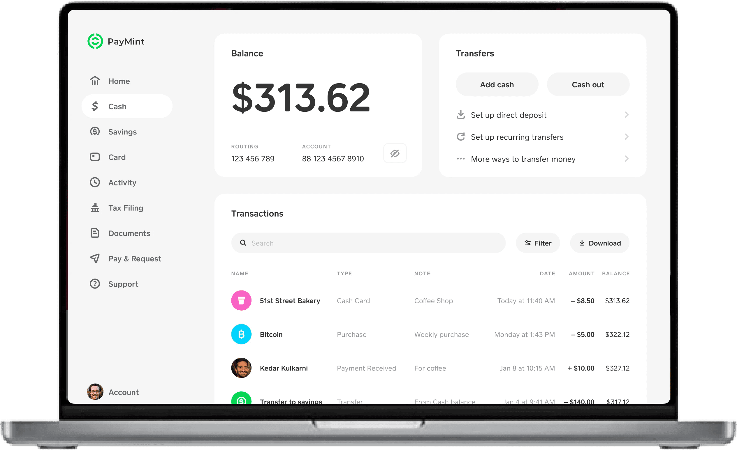
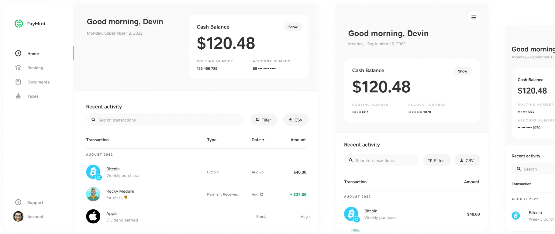
Final Design
Final Design
Screens crafted with the
PayMint web design system.
Screens with the
PayMint web design system.
Here are a selection of PayMint web screens that have been crafted using the foundational design system and its components.
Here are a selection of PayMint web screens that have been crafted using the foundational design system and its components.

Reflection
Creating a design system from scratch requires a lot of work and collaboration.
Creating a design system from scratch requires a lot of work and collaboration.
These are the valuable insights I gained from this project to improve the process of creating future design systems.
These are the valuable insights I gained from this project to improve the process of creating future design systems.
01
Start with intent, not the component.
Focusing on the purpose and user needs before designing specific UI elements. By understanding the problem and desired outcomes, designers can create more effective and cohesive experiences aligned with user needs and business goals.
01
Start with intent, not the component.
Focusing on the purpose and user needs before designing specific UI elements. By understanding the problem and desired outcomes, designers can create more effective and cohesive experiences aligned with user needs and business goals.
02
Set the foundations right.
Establishing a strong framework for the design system such as defining principles, guidelines, and rules for consistent and scalable design. It enables efficient collaboration and ensures a cohesive user experience.
02
Set the foundations right.
Establishing a strong framework for the design system such as defining principles, guidelines, and rules for consistent and scalable design. It enables efficient collaboration and ensures a cohesive user experience.
03
Collaborate early and often.
Involving team members throughout the design system process fosters communication, feedback, and integration between designers, developers, and stakeholders. This approach ensures a shared vision, identifies issues early, and improves the overall quality of the design system.
Industry
FinTech
Role
UI/UX Designer
Timeline
6 Months
Tools
Figma
Explore Other Work
Explore Other Work

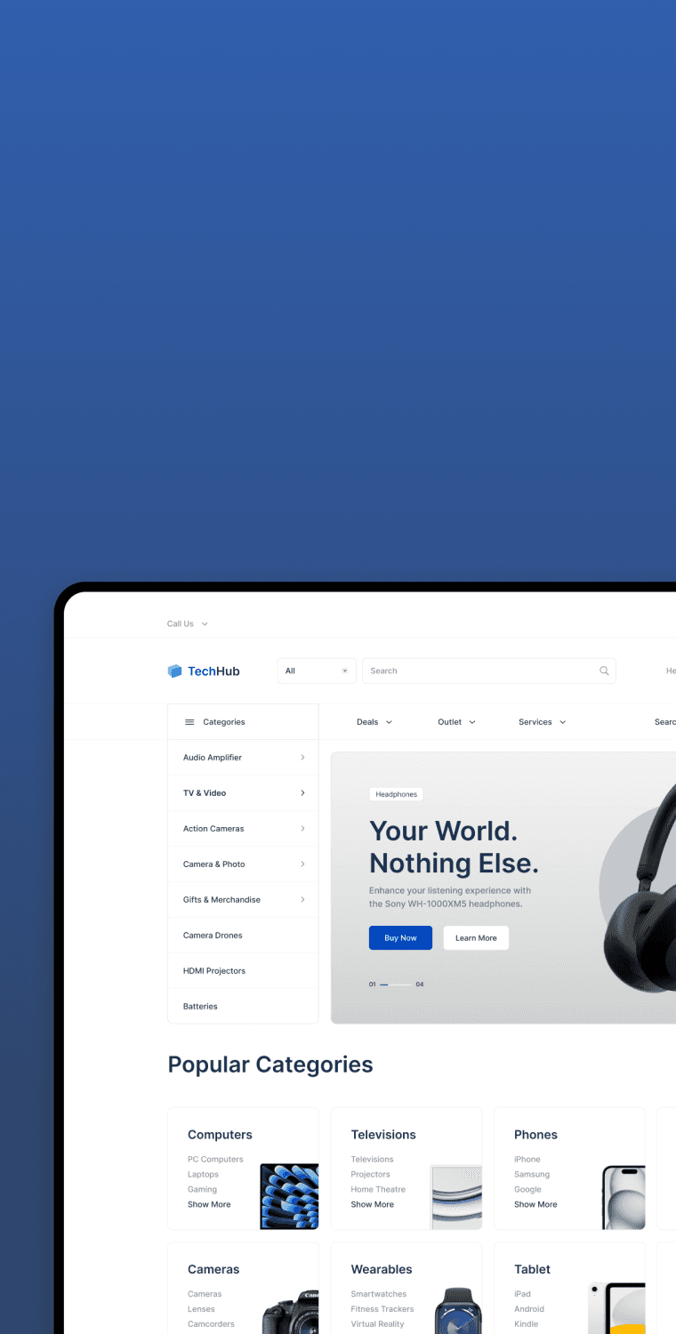
TechHub · Web Design
How Can We Increase Conversion Rates?
TechHub is an e-commerce website designed to provide a seamless experience shopping electronic gadgets online.
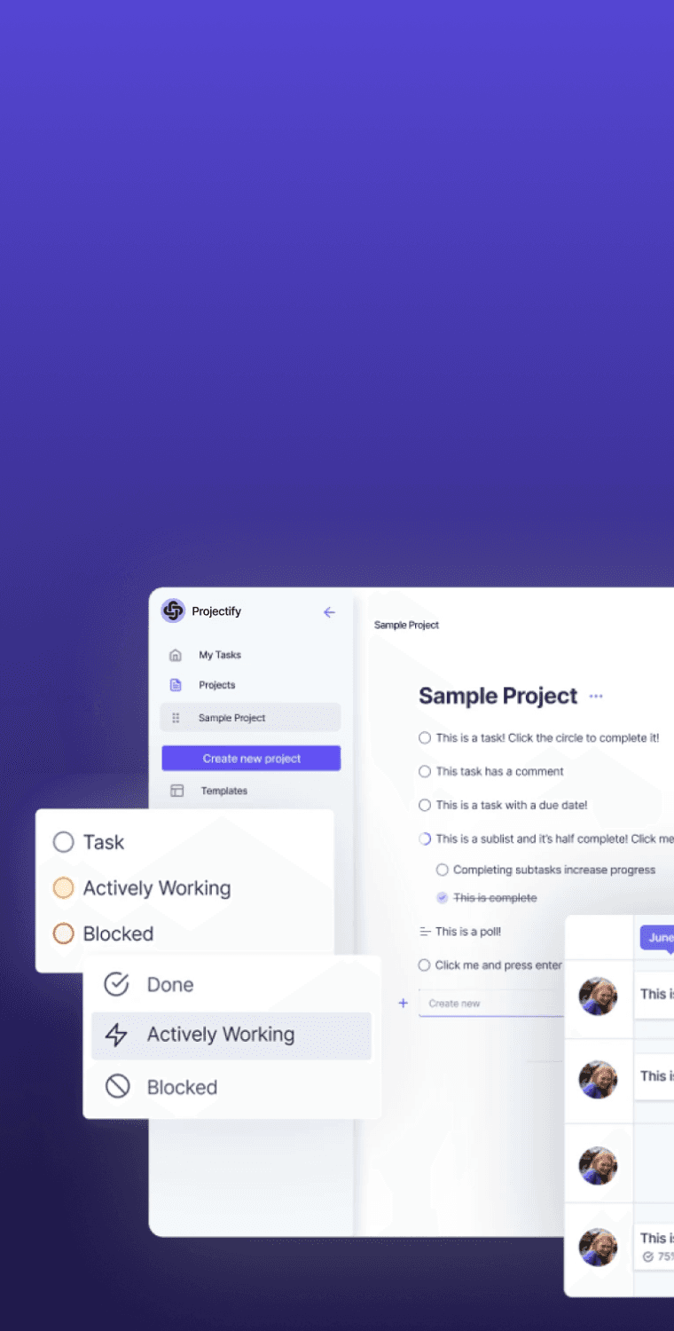
Projectify · Web Design
How Can We Optimize Web App Onboarding?
I investigated why there was a 32% drop in monthly active users, 85% bounce rate, and a stagnant 20% sign-up rate.
FinPay · App Design
How Can We Make Payments Easier?
FinPay is a concept app that enables users to seamlessly send and receive payments, make purchases, and track transactions.
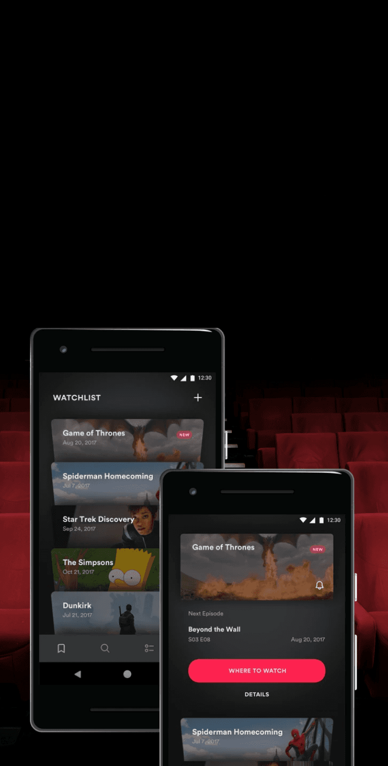
TV Guide · App Design
How Can We Improve Movie Discovery?
TV Guide is the ultimate destination to easily and quickly discover what, when, and where to watch, anytime, anywhere.
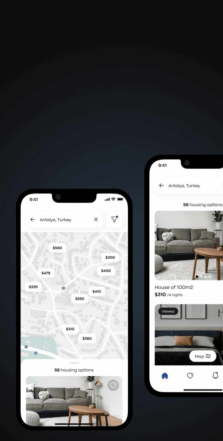
Homeline · App Design
How Can We Simplify The Booking Process?
Homeline is a concept app that allows people to easily to search and book rooms, apartments, and places all over the world.

Caremerge · App Design
Connecting Family To Senior Care Providers.
Caremerge connects family members to care providers so they can check up on their loved ones in senior care.

School Apply · Web Design
Helping Students Land Their Dream Schools.
School Apply helps students find, compare, and apply to any school or program around the world with consultation and support.
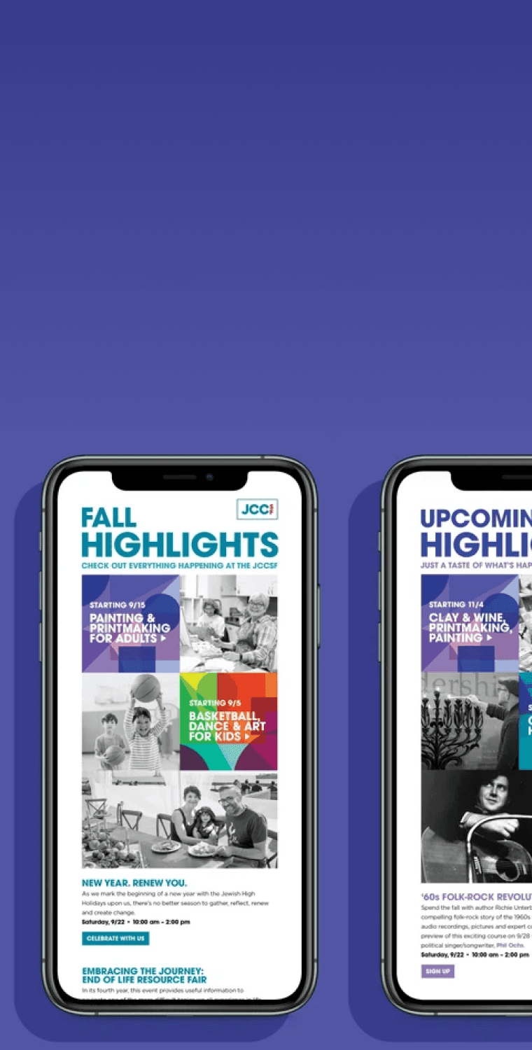
JCCSF · Email Design
How Can We Increase Email Engagement?
I designed and optimized JCCSF's email campaign template to increase clickthough rate and subscriber engagement.
TechHub · Web Design
How Can We Increase Conversion Rates?
TechHub is an e-commerce website designed to provide a seamless experience shopping electronic gadgets online.
Projectify · Web Design
How Can We Optimize Web App Onboarding?
I examined why there was a 32% drop in monthly active users, 85% bounce rate, and a 5% sign-up rate after a UI update.
FinPay · App Design
How Can We Make Payments Easier?
FinPay is a concept app that enables users to seamlessly send and receive payments, make purchases, and track transactions.
Homeline · App Design
How Can We Simplify The Booking Process?
Homeline is a concept app that allows people to easily to search and book rooms, apartments, and places all over the world.
TV Guide · App Design
How Can We Improve Movie Discovery?
TV Guide is the ultimate destination to easily and quickly discover what, when, and where to watch, anytime, anywhere.
Caremerge · App Design
Connecting Family To Senior Care Providers.
Caremerge connects family members to care providers so they can check up on their loved ones in senior care.
School Apply · Web Design
Helping Students Land Their Dream Schools.
School Apply helps students find, compare, and apply to any school or program around the world with consultation and support.
JCCSF · Email Design
How Can We Increase Email Engagement?
I designed and optimized JCCSF's email campaign template to increase clickthough rate and subscriber engagement.